Woody Warehouse Nursery, Inc.
Discovery. Research. Sketches. Iterations. Finals.
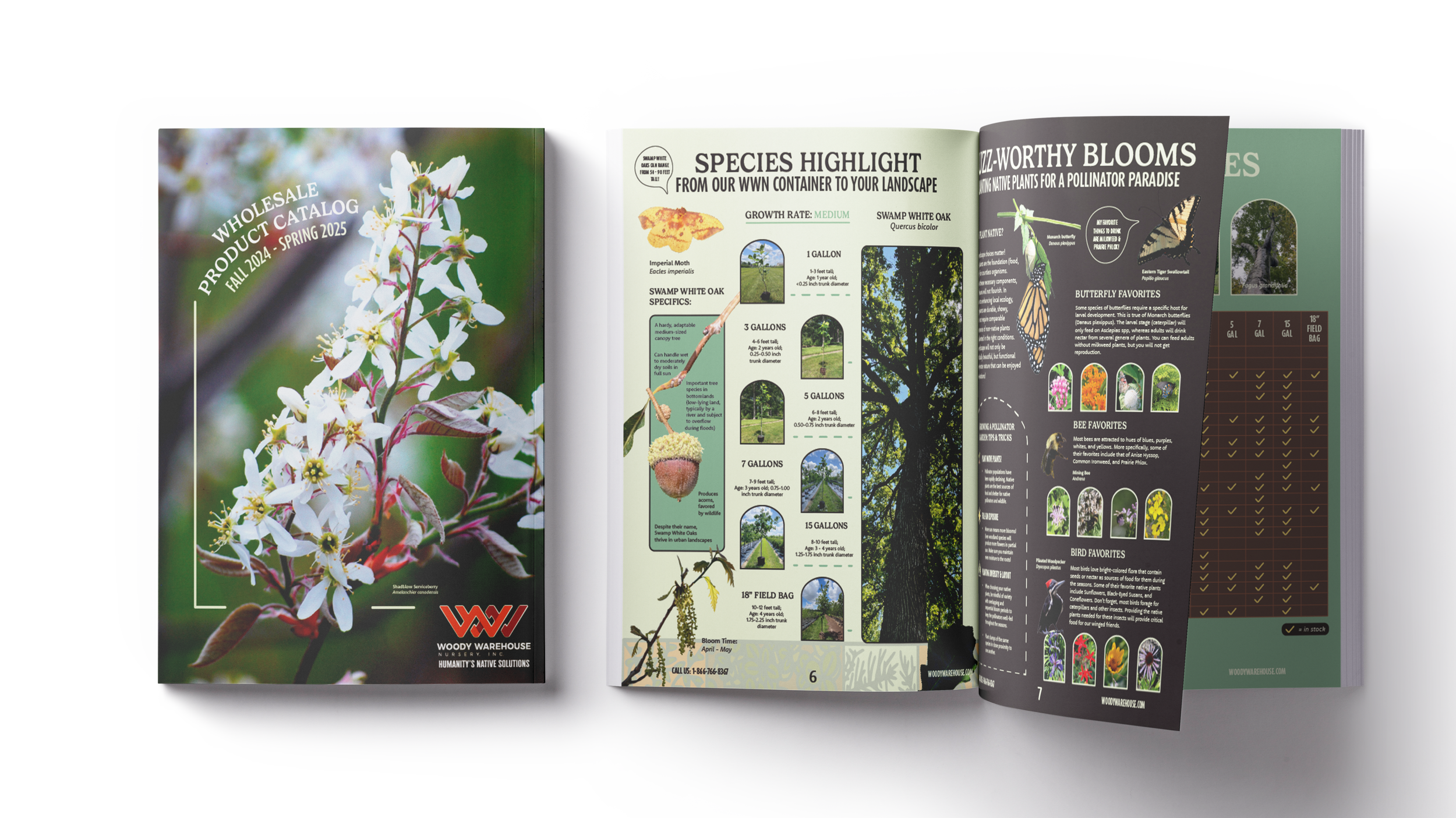
Woody Warehouse Nursery Inc, (WWN) employed me as their lead graphic designer for branding their company, creating multiple marketing assets, and preparing them for one of their bigger trade expos they have this year. WWN had not ever hired a graphic designer before, so I helped them define their intentions and marketing clearly before we began any type of design work. From there, I carried out research, looked at analytics of target niches they wanted to attract within their field, and got to work. From there, I created multiple marketing assets and deliverables, as well as their wholesale product catalog and cultural guide, just to name a few before you scroll. The pictures within this catalog were taken by me, the Sales and Marketing Manager, as well as the Sales Representative.
Client
Woody Warehouse Nursery Inc.
Months & Year
January - August 2024
Deliverables
Catalog, Posters, Flyers, Email Promotions, Trade Expo Banners, Marketing Materials, Additional Elements to Visual System, Customer Guide
Context of Catalog & WWN’s Visual System of Elements:
When I was hired as WWN’s contract graphic designer, upon agreement, management knew they wanted a catalog showcasing their product selection and highlighting their new species for the upcoming year.
With this, each deliverable created needed to additionally showcase the importance of planting native and how we can help to restore and conserve our environment for generations to come.
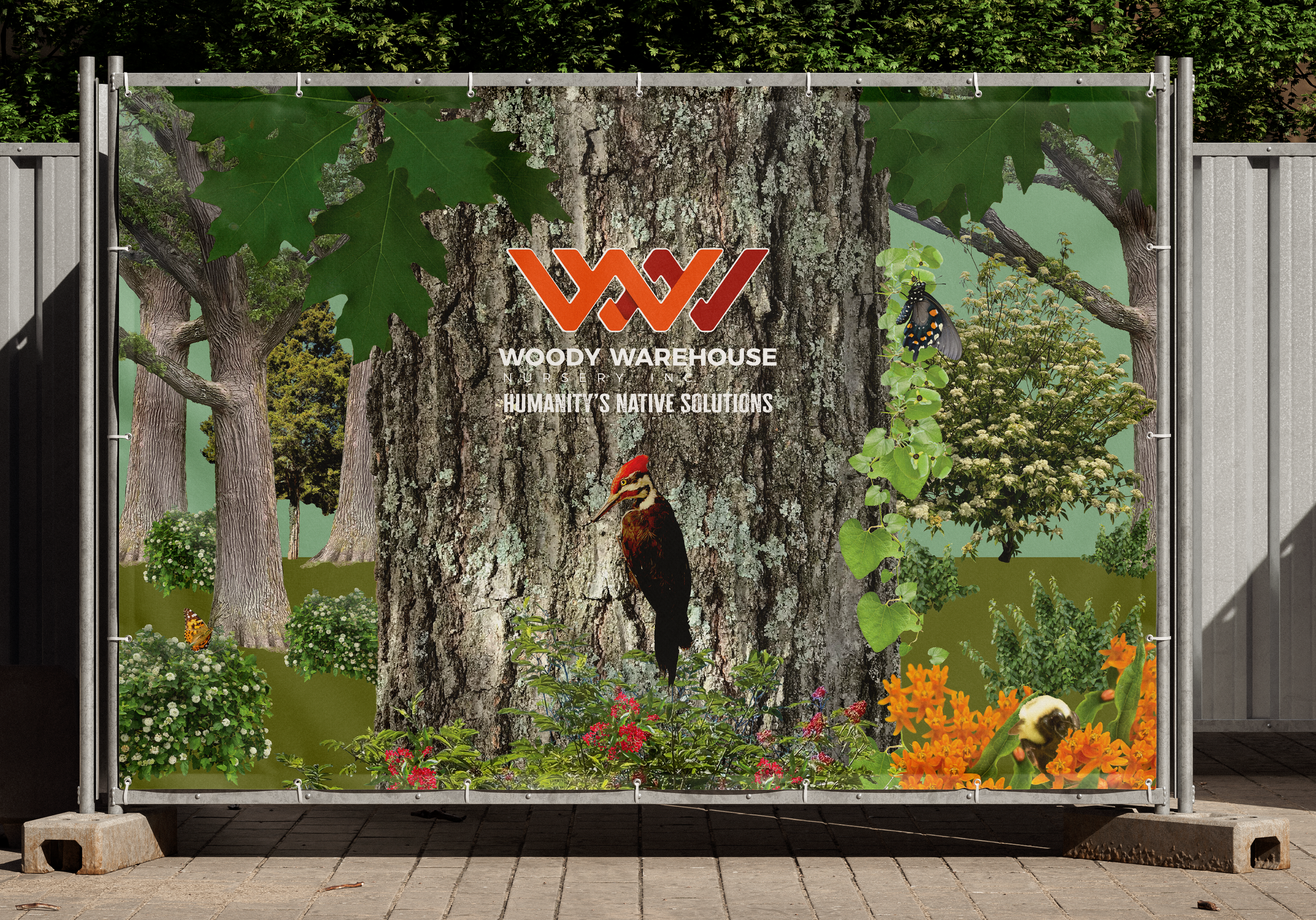
Pop Up Banners:
Because Cultivate is one of the bigger trade expos WWN participates in, we needed our pop-up banners to truly emulate the story of the company, but only using imagery of our plants to depict WWN’s story.
WWN wanted to showcase each type of product they have at their nursery, so each “slide” separately acts as it’s own “environment.” When all threee slides are compiled together, they display an ecosystem landscaped with specific products relevant to their best-sellers and native wildlife relevant to each tree, shrub, vine, and herbaceous plant.

Visual Systems and Branding Deck:
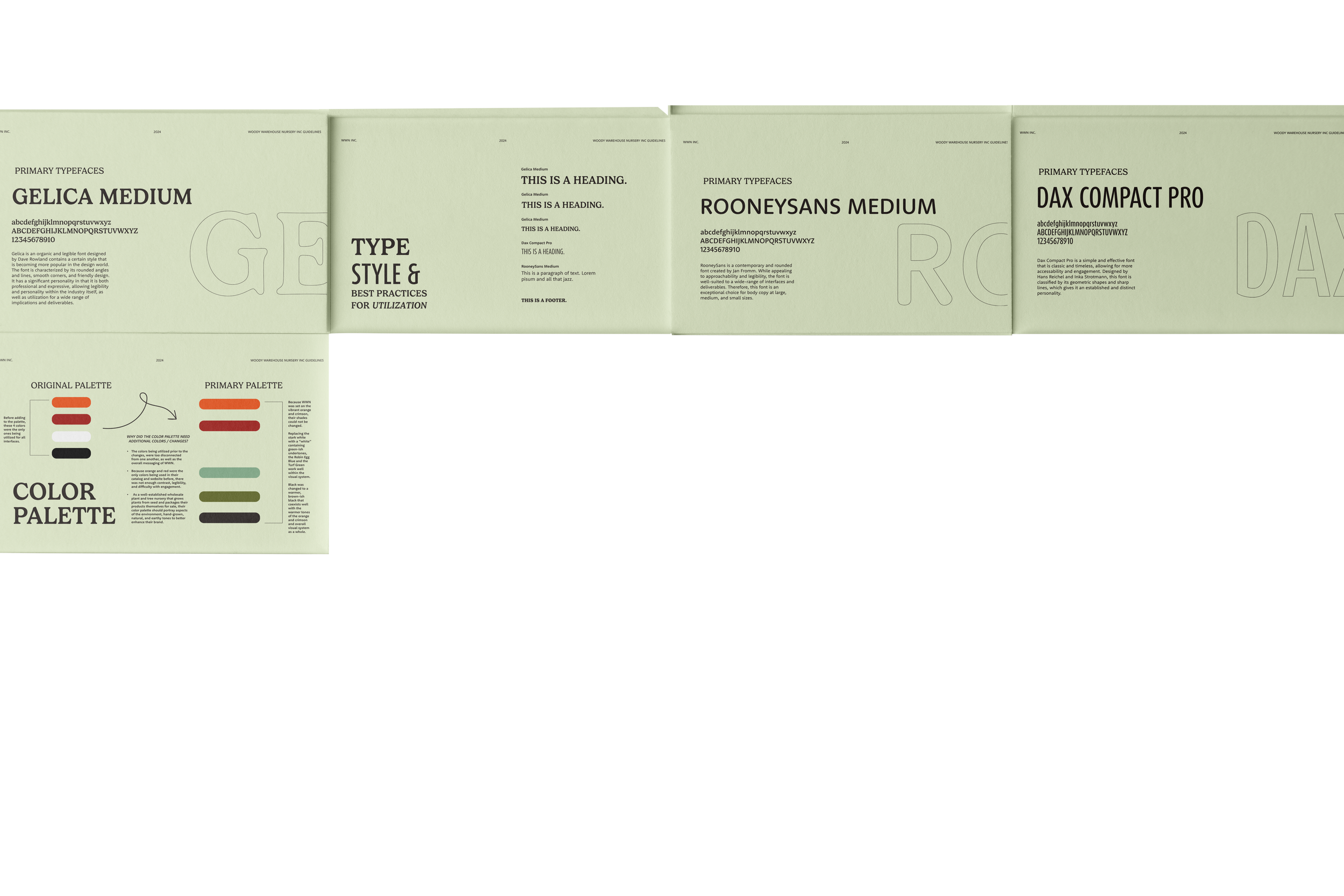
Due to the multiple assets added to WWN’s pre-existing visual system, I decided it would be beneficial for their company to have a branding deck, dedicated to new colors and fonts, as well as the reasons for choosing them. This way, they’re able to understand why and how to apply these visuals cohesively and consistently throughout their branding.
Cultural Guide:
Due to the need for WWN to reach their customers on all terms of accessibility and with their trade expo approaching fast, I produced a Cultural Guide that customers could refer to with each plant and tree specific to the catalog. These two "key" pages at the beginning of the guide allow customers to read and digest the information that is about to be presented to them.
Each category shown represents information relative to each specific plant and tree WWN sells. Customers can refer to this guide in case they have any questions regarding soil ph, sun exposure, soil moisture, growth rate, plant types, pollinators, and more.
Each plant and tree contains a line of sub-categories in which WWN’s customers can refer to the front of the guide for more information regarding them.
I also created a digital version of this Cultural Guide as well to adhere to all forms of accessibility WWN wanted to reach.
WWN root’s literally grew from a red oak tree seed and now, tree is central to the property. It is a vital part to telling their story, so I felt it should be incorporated within their visuals whose main goal is to showcase the different species WWN grows from seed. The Red Oak in the center shows where WWN laid their cornerstone in the beginning, and the surrounding vegetation, shows how they have and will continue to expand the species they offer. Additional species include shrubs, vines, and herbaceous, which are now just as crucial to their story.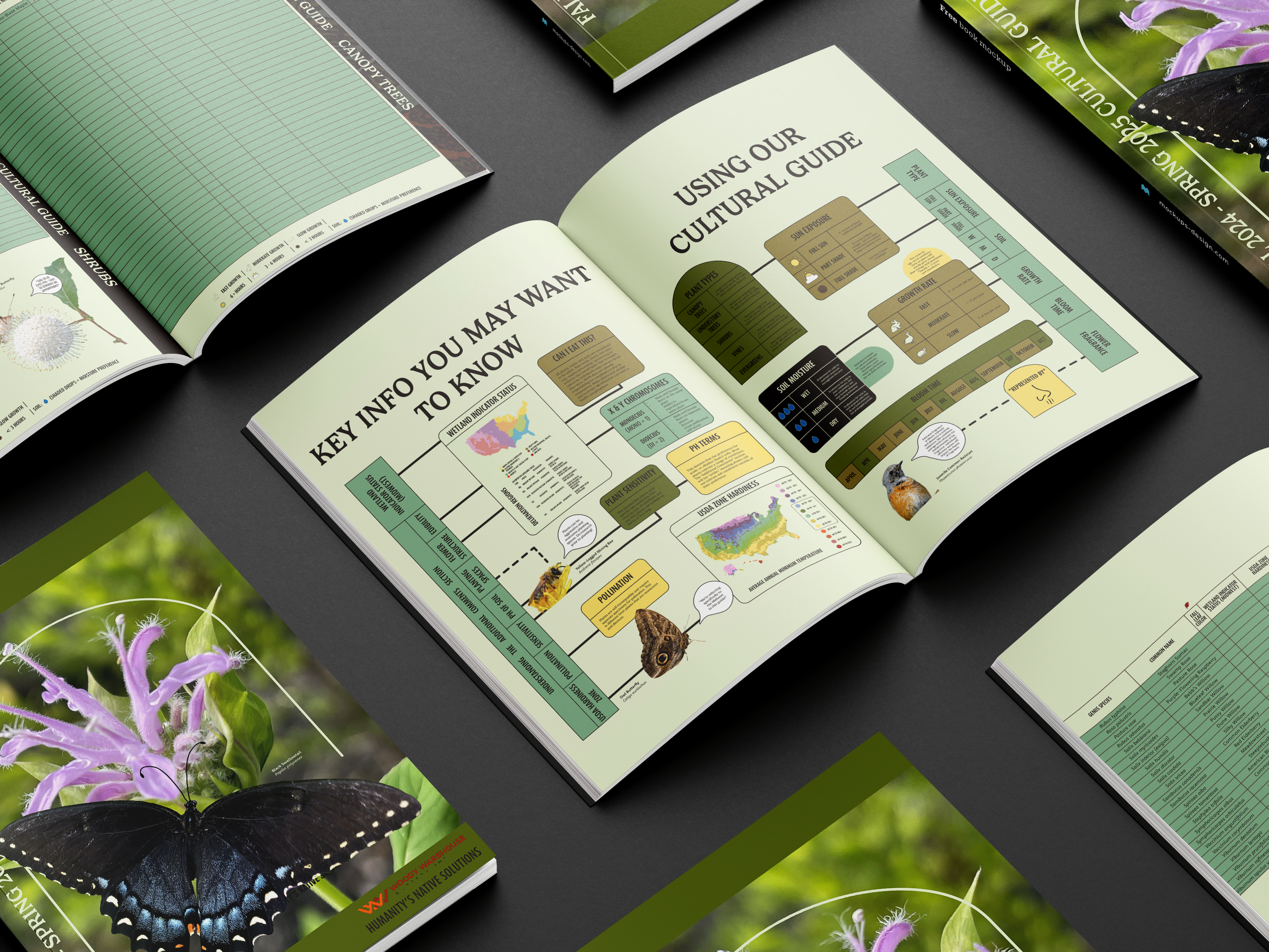

Field Day: Each year, right before peak season (Fall), WWN invites their friends, nurseries, and customers to this event. During, the invitees can expect to tour the grounds of the nursery, receive a history lesson in the nursery itself, and look at case studies they’ve participated in with different foundations during the year. This year, there is a focus on native plants and pollinators.
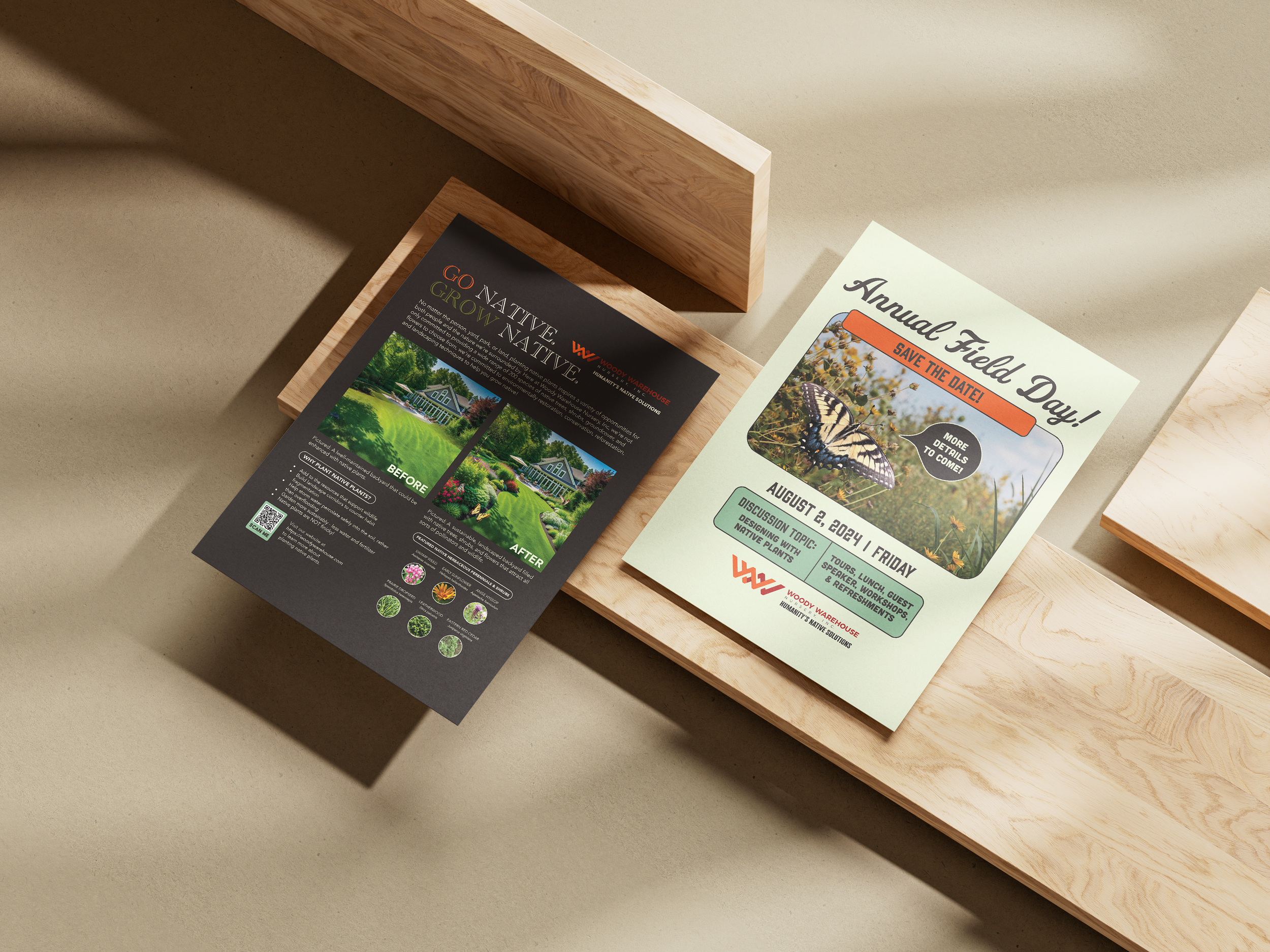

Go Native, Grow Native: Their sales representative requested materials to give to nurseries after promoting their products - something accessible and memorable. From this objective, I wanted to take her ideas and create a flyer that would give customers an idea of what a native landscape could look like in their target niche’s backyard.
Because they did not have any pictures depicting this, I decided to try my hand at Midjourney to design a backyard from scratch with a typical midwest house in the suburbs, as this is what a typical environment of the customer’s niche would look like.
From there, I used Adobe Photoshop to add pictures of native trees and native herbaceous species we offer into the scene, adding shadows and highlights to be more “realistic,” and placing our pollinator friends to emphasize the importance of planting native!
