NOMU
Background
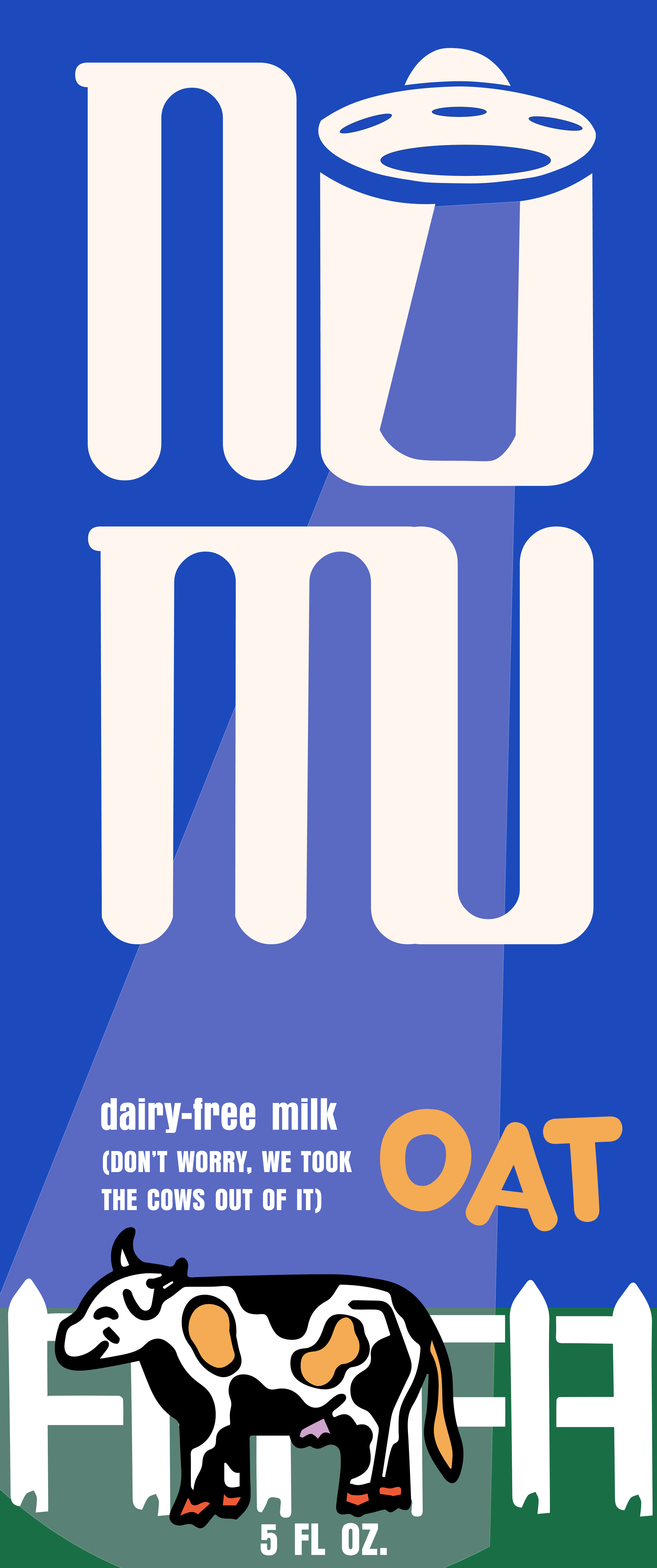
An oat milk company, NOMU, needed a visual identity and brand packaging that was “out of this world.” Because of the company’s name and play on “no moo,” meaning “no cows,” I knew immediately I wanted to incorporate illustrations within this branding that enhances that messaging, while remaining playful and unique, as these were moods they wanted to convey. From the initial brief, I began sketching and playing with illustrations and typography, while taking into account that most of their packaging would be vertical milk cartons, so the logo/symbol within, should be fit to such.
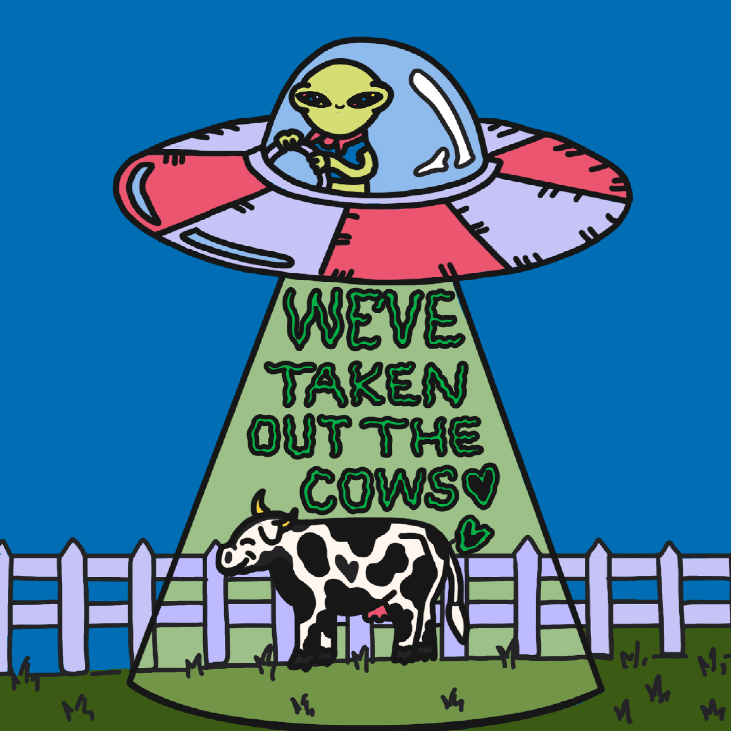
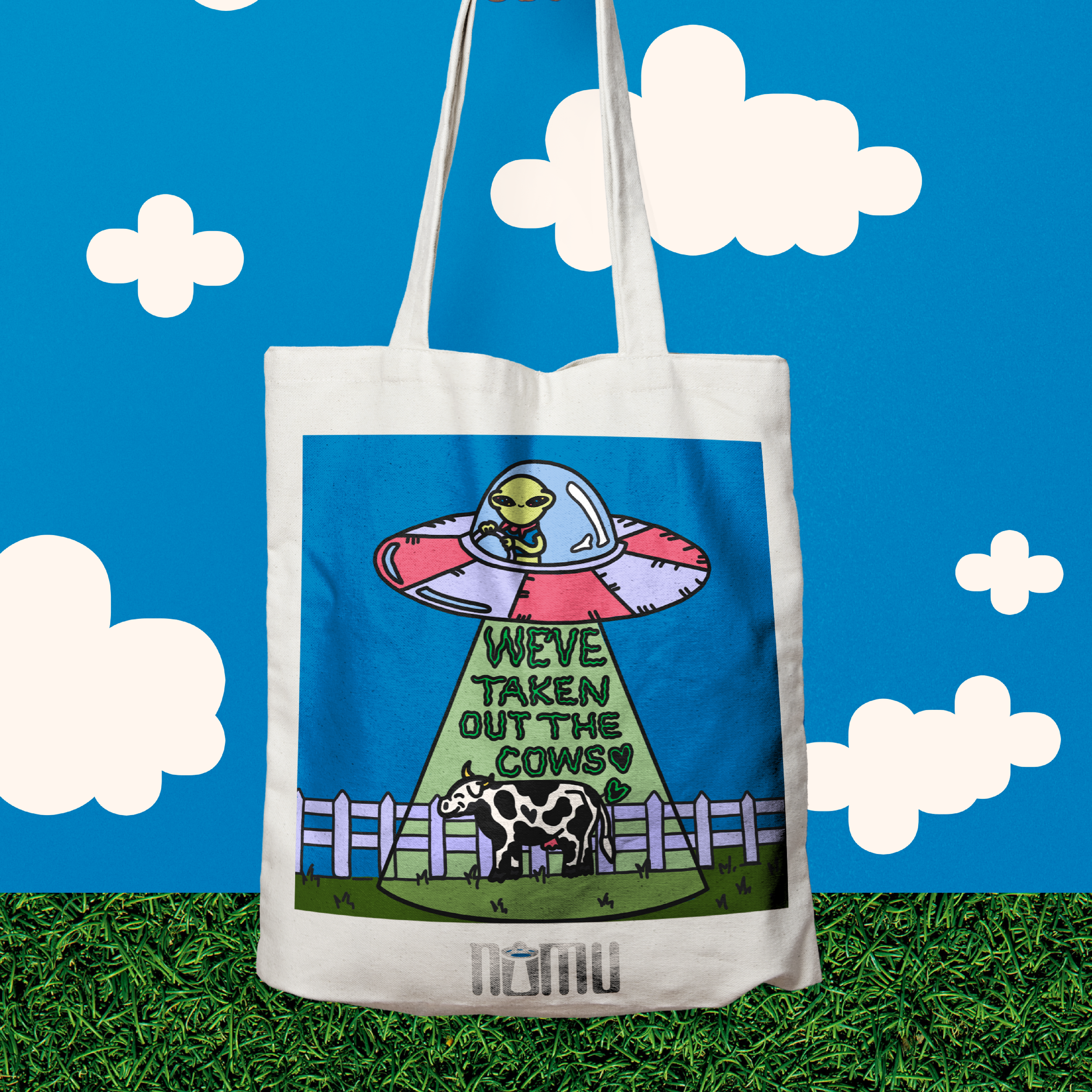
Initially, I asked myself this question during the sketching phase of the design process, and the obvious answer is "because it's oat milk," but that's not fun or whimsical. Let's think a little more playfully with this - who is in charge of the oats? Farmers, probably. who are taking the cows out of the oat milk? Why are they taking the cows out? Then, I realized I was onto something ...
Let's take our first answer: Farmers and our second: Aliens - what do we get?
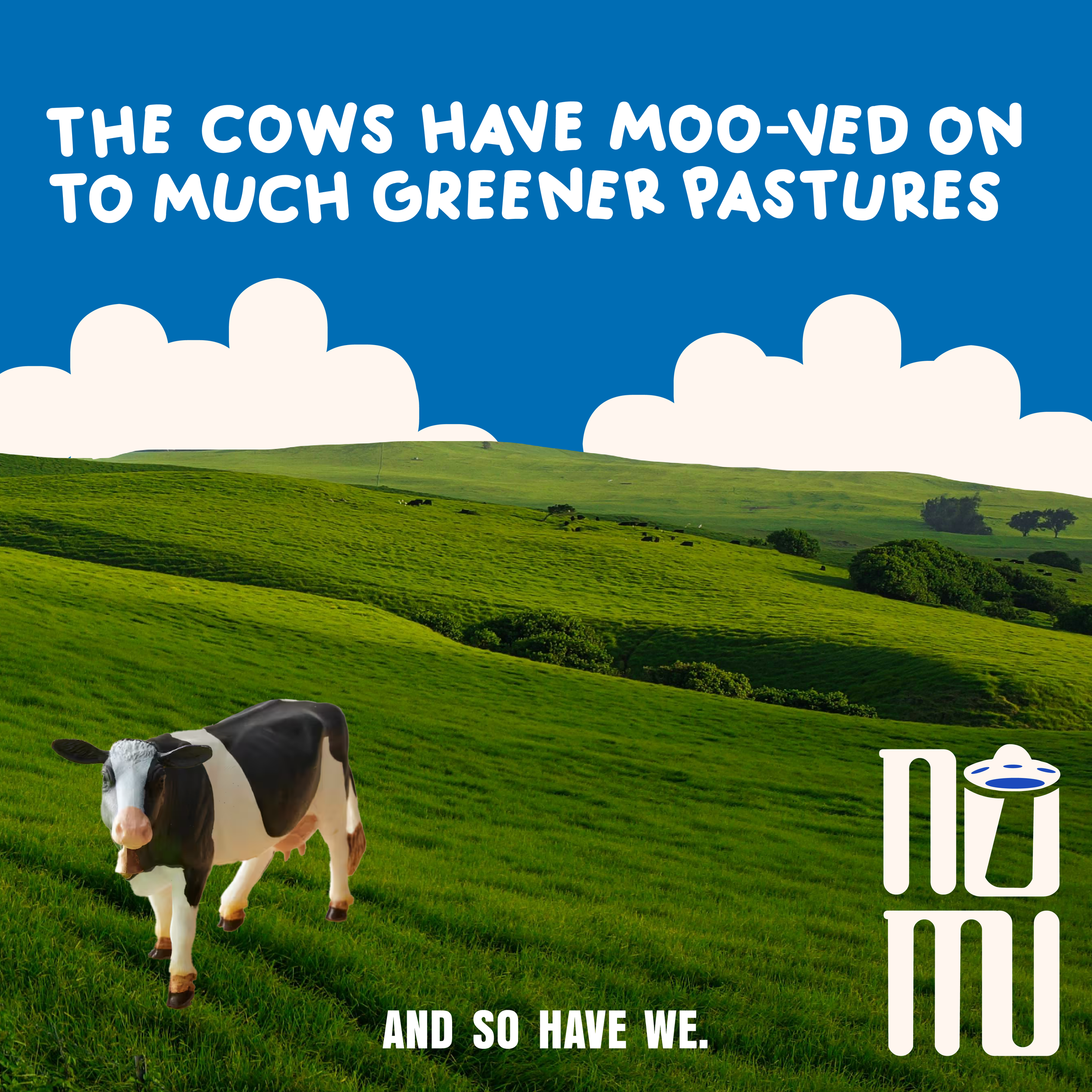
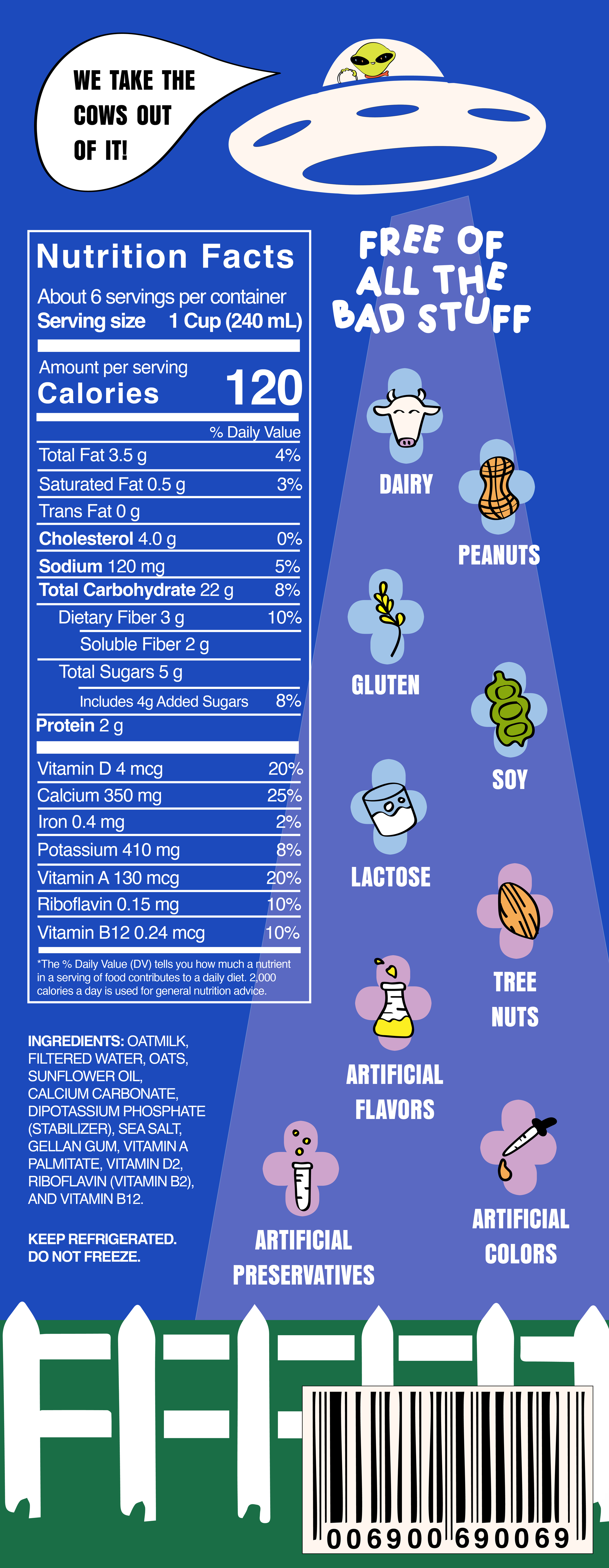
Alien Farmers! How impactful and distinctive would it be to drive home the messaging of their brand: "out of this world flavors," along with illustrations. Thus, NOMU’s lil alien farmer guy was born. You'll find him (and his cow) on the back of the NOMU cartons next to the nutrition facts.

after i found the font i thought would be perfect for the logo, i began to play around with the round shapes and the ufo appeared - the best "farming" equipment for their alien farmer!
Client
NOMU
Year
2024
Deliverables
visual identity, packaging, social media

CHECK OUT THIS FUN motion graphic I did on procreate and procreate dreams! I'm still progressing through these programs, but I'm pretty proud of this one being my first try at motion design within procreate using my own illustrations!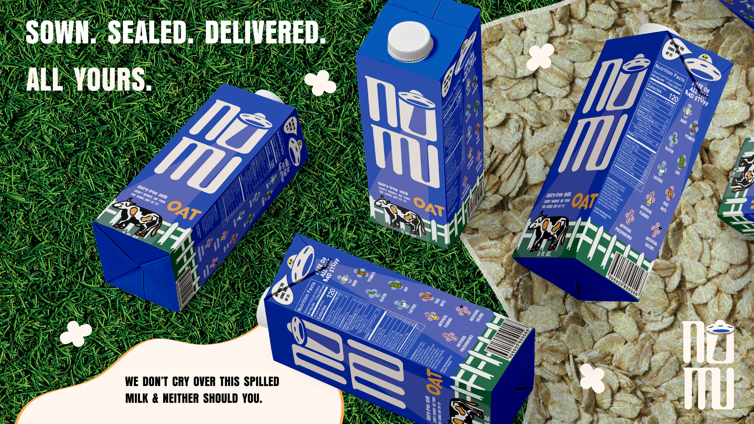
Illustration Concept
“Why would there not be cow’s milk
in the oat milk?”
nomu's logo was created during the illustrator process - i believed my sketches were either too-detailed or too simple, so i tried something new and went to illustrator after choosing a font i wanted to play around with, which became a perfect home to harbor nomu's alien farmer's ufo.Final Deliverables
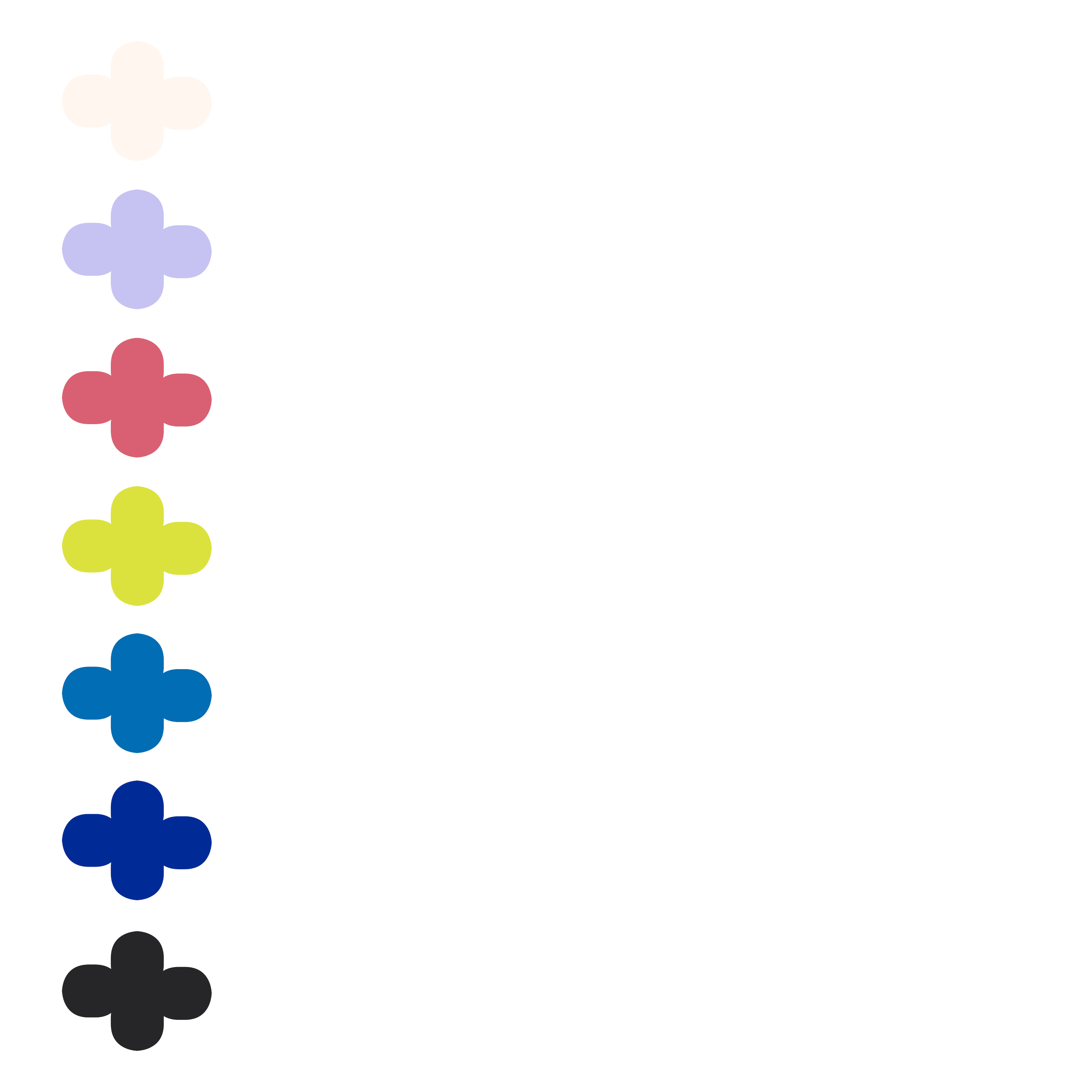
influenced by the natural world, the color palette is organic with a hint of otherworldly to represent how the alien farmers fit within this "farming society" that has become nomu's brand.