Green Box
Background
Green Box is an Ecommerce plant shop for indoor plants and vegetation open to the public. Although this project remained open-ended from the beginning to end, they specifically needed a modern and minimalistic brand identity, in addition to cohesive packaging for their products. Overall, I learned a multitude of skills within the Adobe Creative Suite for this project (which is always a win in my playbook!) Specifically, I became more knowledgable designing packaging for the different sizes of boxes, material handling and how the design can interact with the kraft paper from creation to shipment to arrival, as well as creating graphics that are both expressive, while remaining true to the company’s visual design system and values.
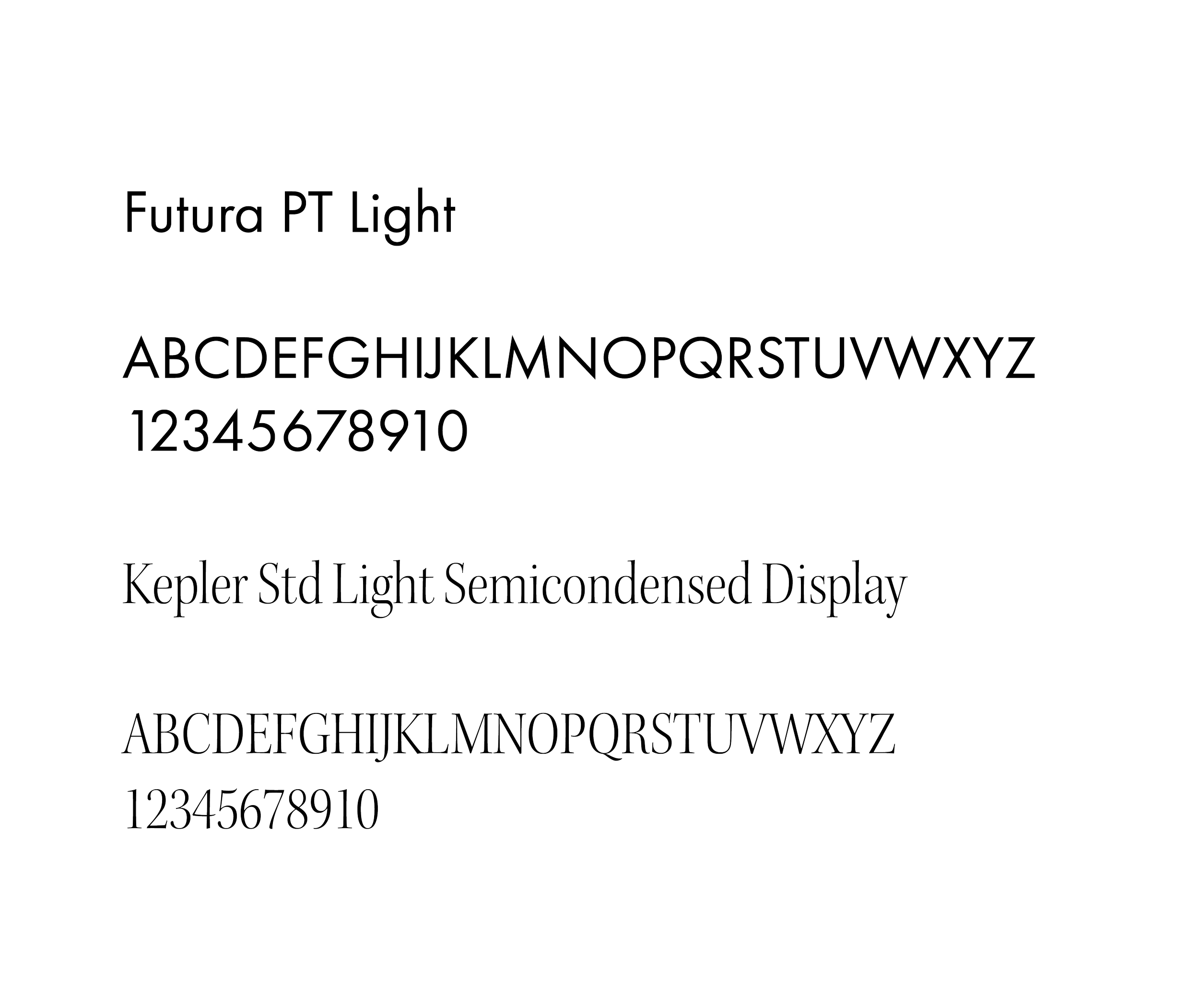
Both fonts chosen contain rounded, organic type, perfect for an environmental and natural company such like green box. Futura is also a classic and timeless font that is legible and expressive at the same time.
Client
Green Box
Year
2024
Deliverables
visual identity, packaging, social media
Final Logo Iterations
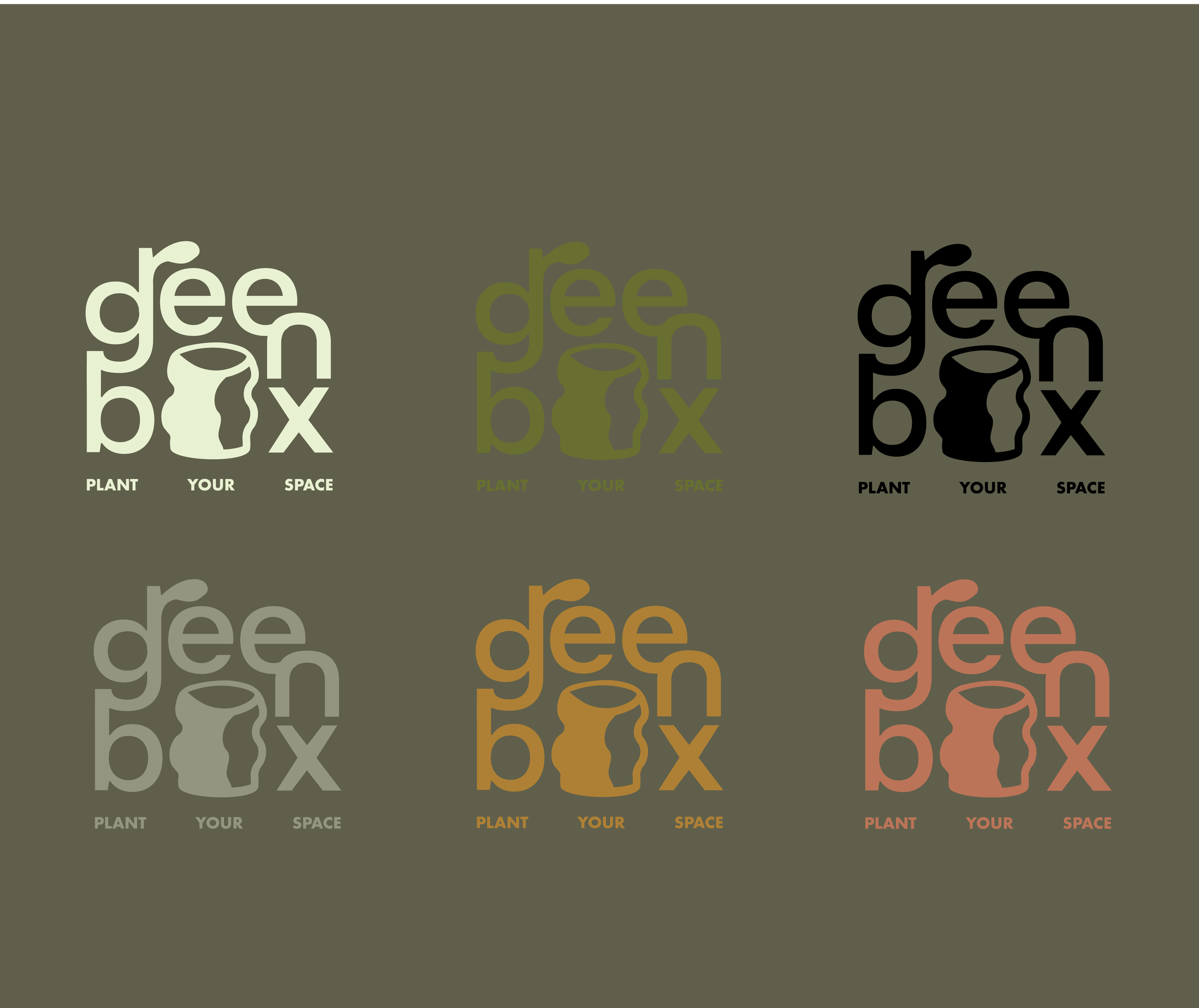
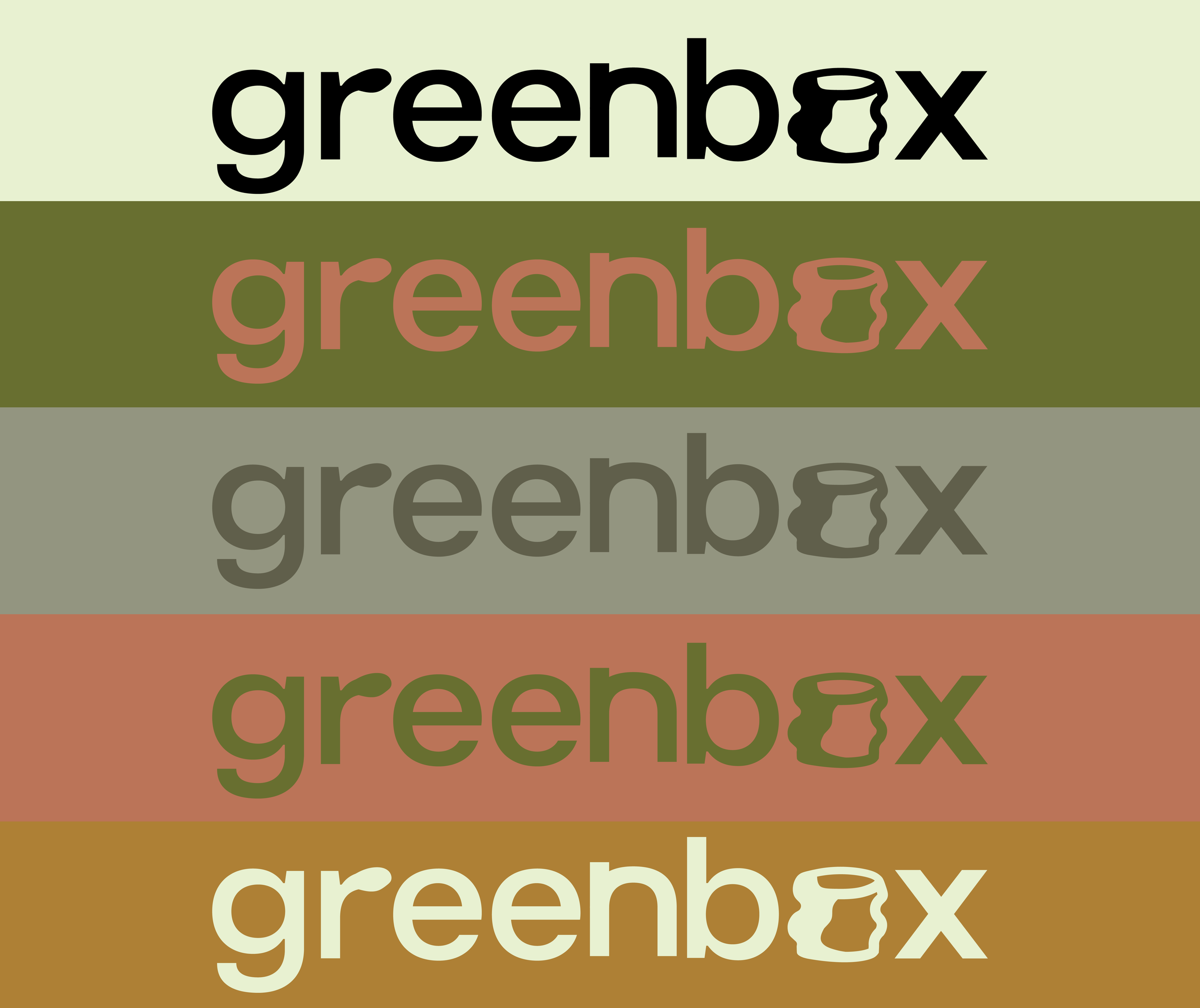
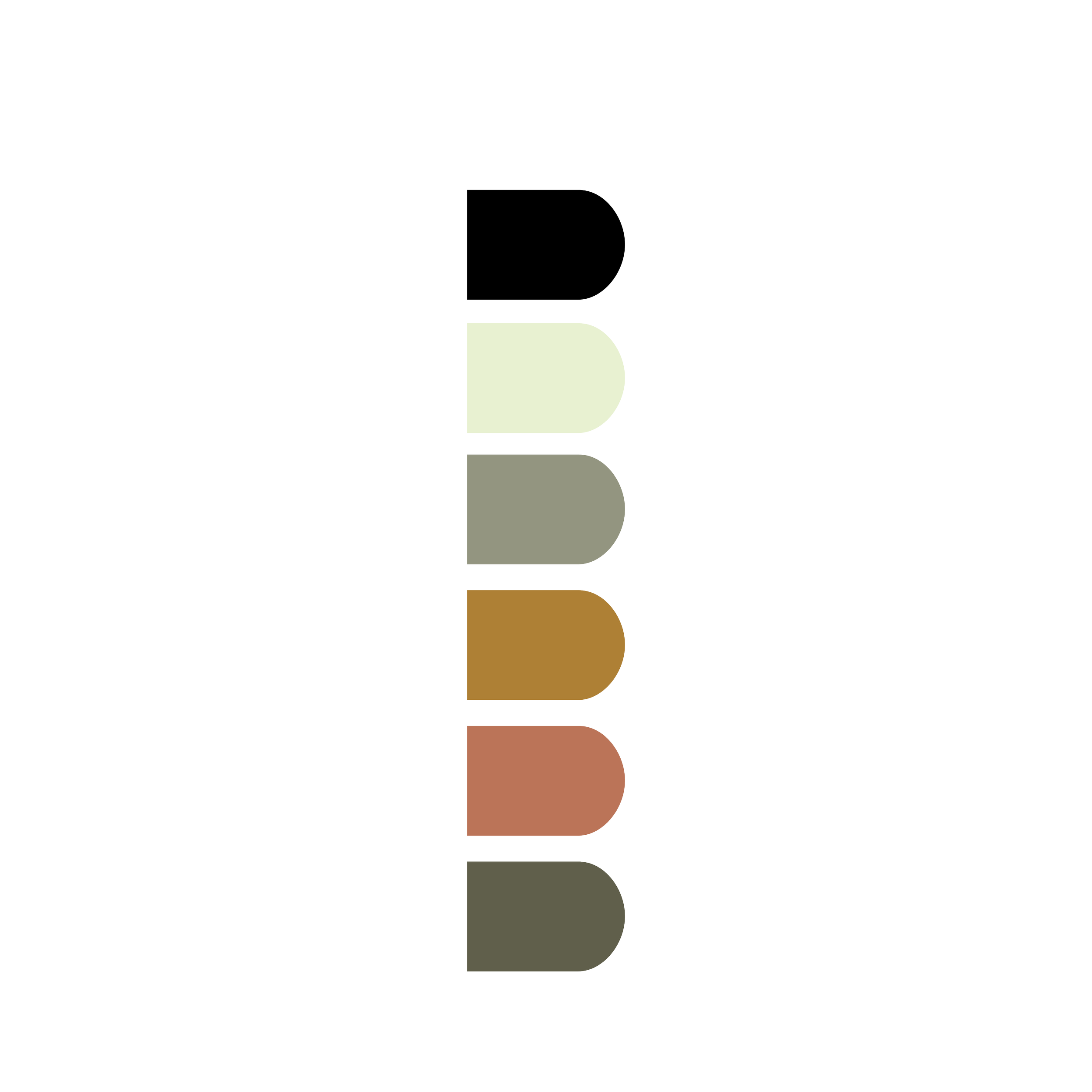
Although the color palette fit this branding, for future purposes, we thought trying different color combinations for future products, promos, and marketing deliverables would be a great idea. from this, we decided to stick with cream and black as the primary colors for the logo with packaging, but now have the opportunity to expand in the near future as they continue to grow!
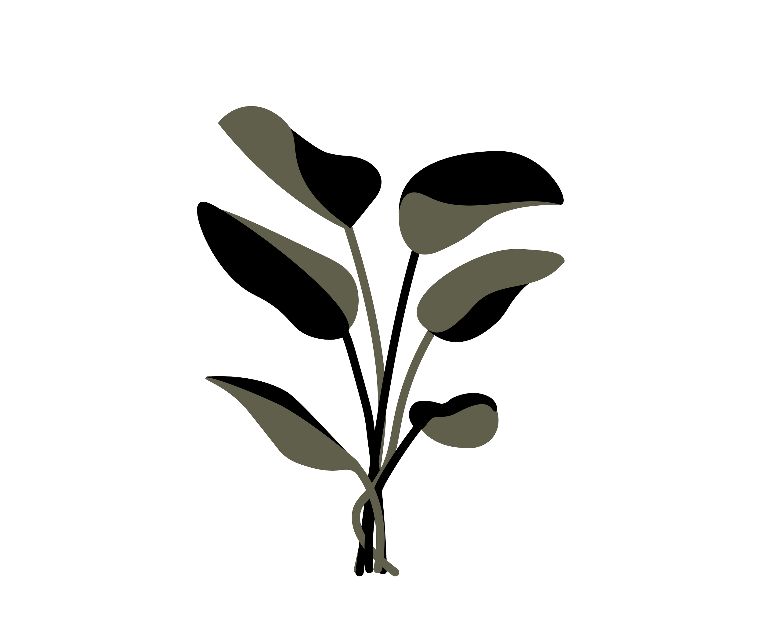
Primary Typefaces
Visual Design System

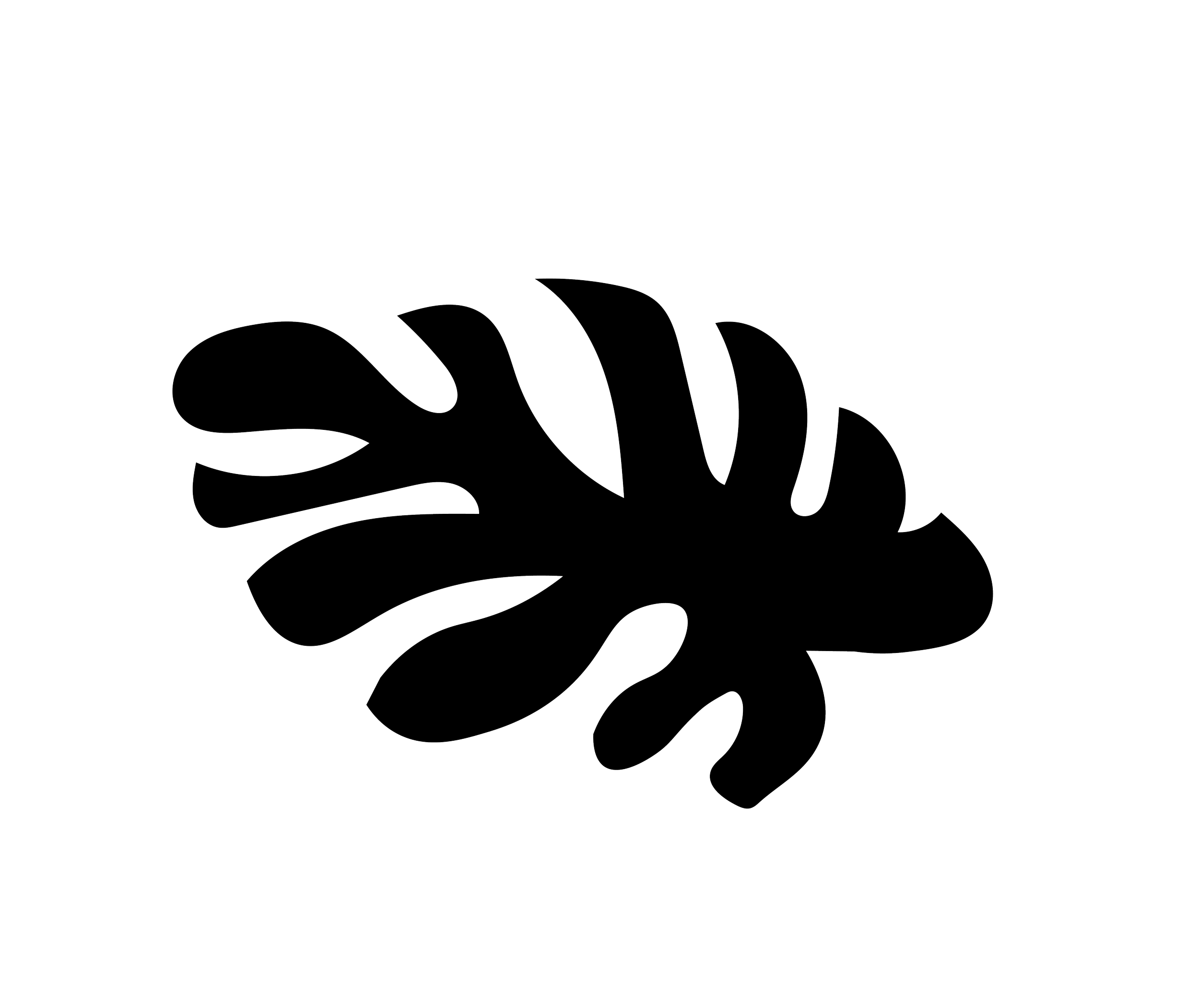
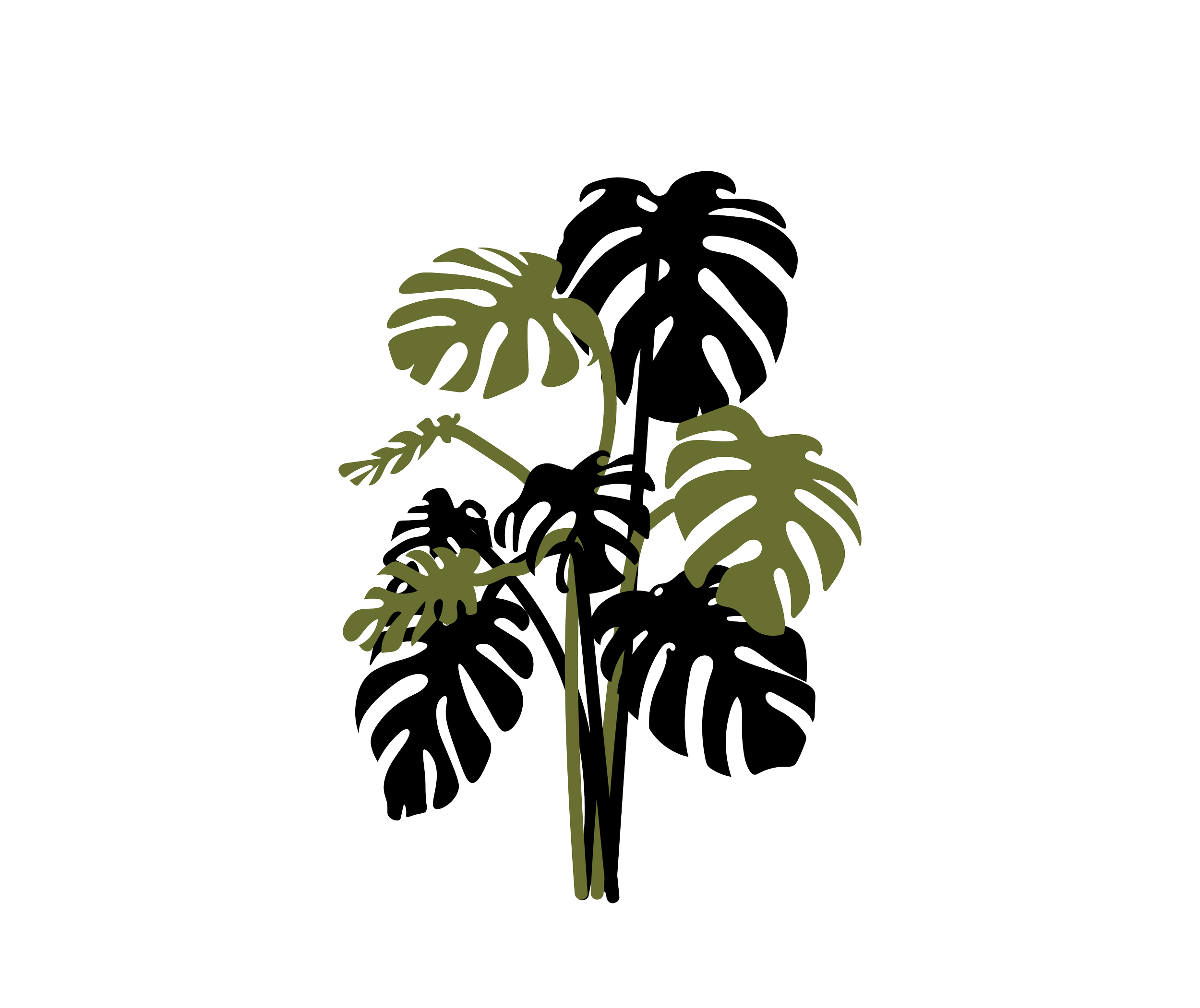
Monstera Plants are symbolic of abundance, growth, and new beginnings - not only do Monsteras sell the most at Green Box, they also represent this small business’s new chapter of life, as their journey began.
Final Deliverables
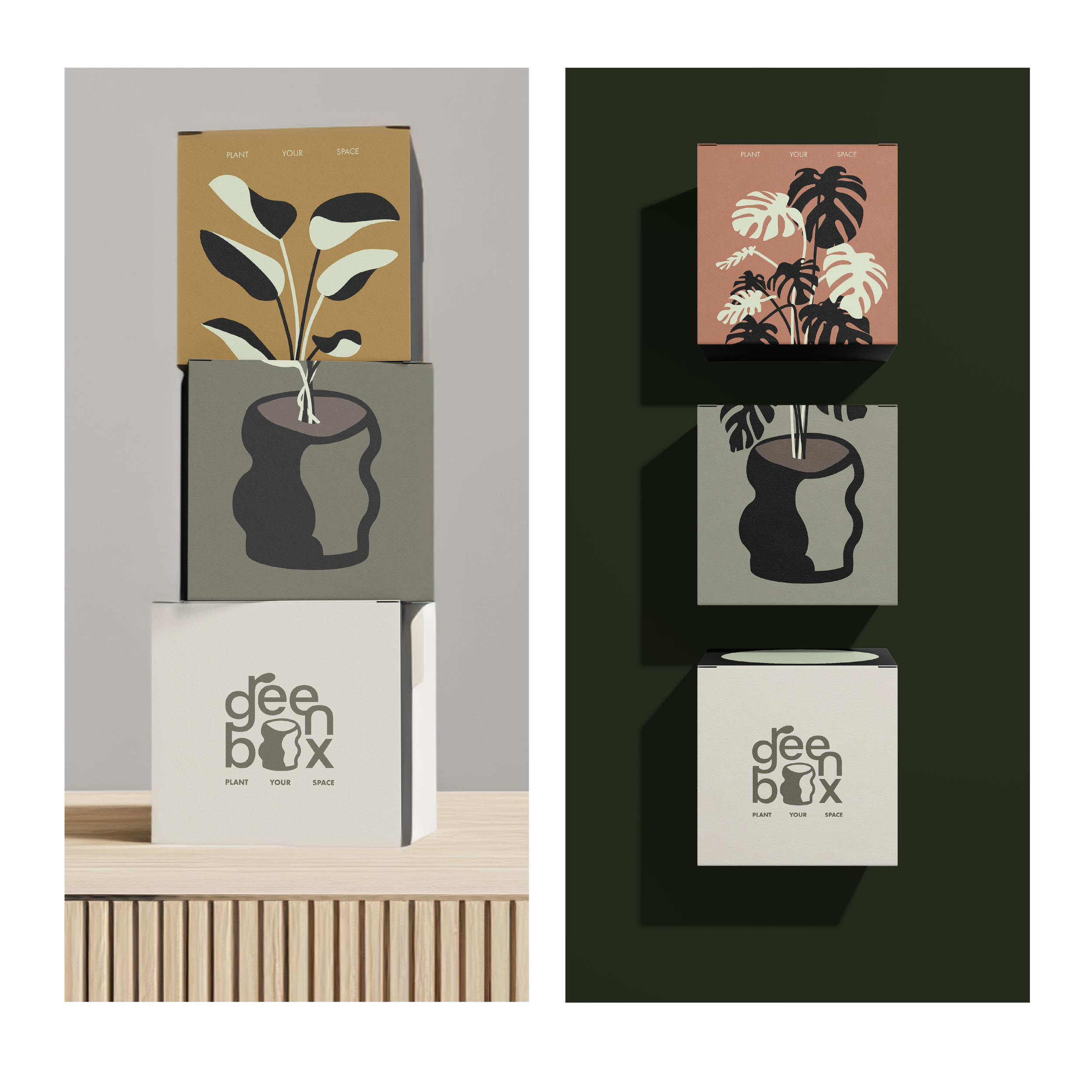
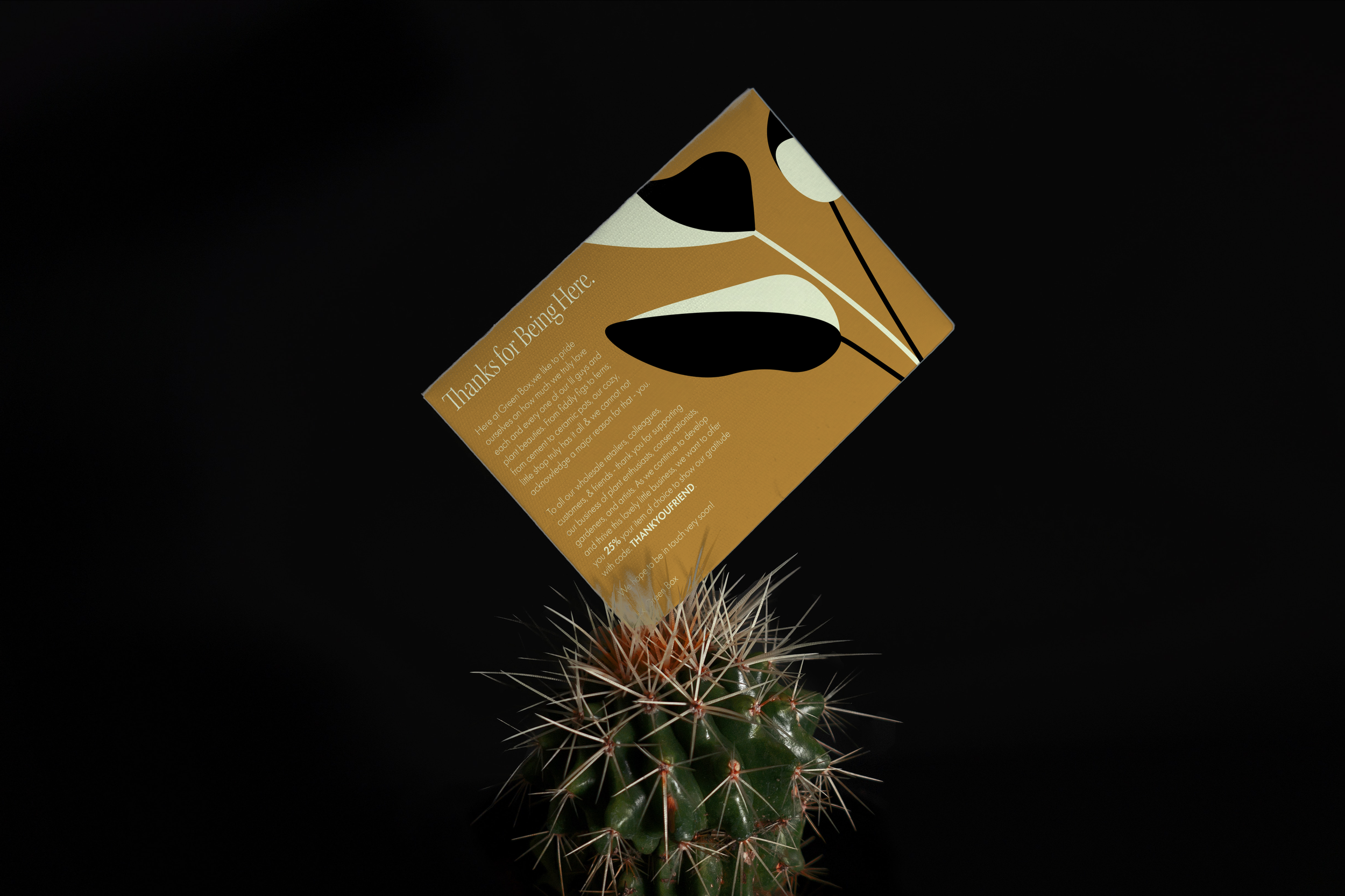
within each order green box sends, there is a thank you note attached with an offer for a discount to be used, as part of a promotional award for their plant enthusiast-based customers.Green box found their most popular product is their plant bundle, where customers can buy a handmade pot of their choice, plant, and soil - each arriving in separate boxes. Therefore, the final product needed to remain visually cohesive and representative of using each element together, which truly does just that.